Card
The Card and Card Deck media items provide a stylized and interactive way to display bits of information. Cards can be used standalone, however they're often best used within a Card Deck.
Basic Example
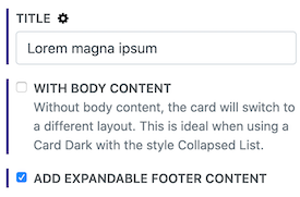
This example shows questions and answers with more information that can be revealed in the card footers. How was this done?[1]
Card Deck Options
The Card Deck sets up the styling and display options for the cards.
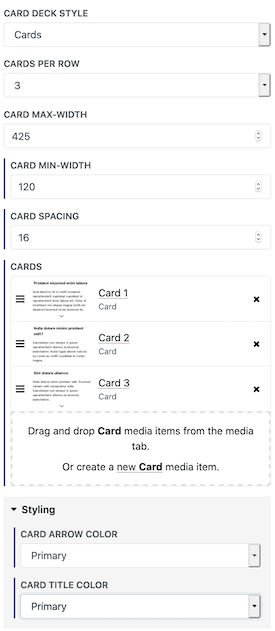
Card Deck Style - There are two different styles for the cards:
Cards - When set to Cards, each card is it's own block.
Cards Per Row - The number of cards per row. If the cards don't fit then they'll collapse to the next line and stack up.
Card Max-Width - This can prevent the cards from being larger than desired.
Card Min-Width - On smaller screens the cards may get scrunched up too small, so setting a min-width will make sure they always display nicely.
Card Spacing - This sets the amount of space in between the cards.
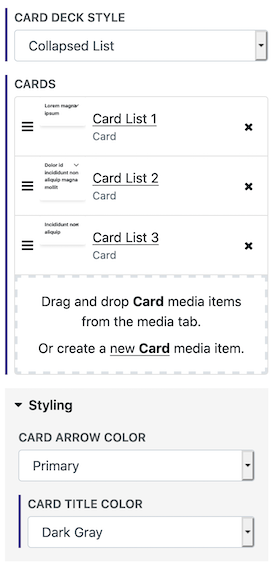
Collapsed List - When set to Collapsed List, the cards are joined into a single column in a list style.
Styling
Card Title Color - Sets the color of the card titles.
Card Arrow Color - Sets the color of the toggler arrow for opening and closing the footer content.
Examples
This is a card deck with the Collapsed List style. How is this done?[2]
The 3 Cards were created and added to the Card Deck. These are the options for the parent Card Deck:


