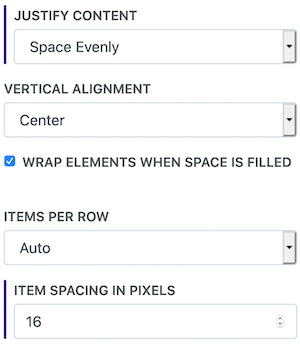
Flex Container
The Flex Container is useful utility for aligning groups of elements in stylized ways that aren't easily done in the normal flow of the editor.
Options
Justify Content - This controls how the elements are aligned horizontally. They can be centered, left or right aligned, or spaced out evenly.
Vertical Alignment - Elements can be aligned at the top, bottom, or centered vertically.
Items Per Row - You can control how many items are displayed in each row. By default the items are filled in based on their natural size.
Item Max-Width - This lets you ensure that items don't become too large when filling space.
Item Min-Width - When the items are pulled closer together on small screens they can sometimes get to scrunched up. Setting a min-width can help prevent that.
Spacing - This sets the amount of space in between each item.
Examples
This is an evenly spaced group of buttons. How is this done?[1]
This example shows a thumbnail photo gallery. These are also able to be viewed full-screen by applying the Image Zoom style to the Flex Container. How is this done?[2]
The Button media items are added to the list of items, and then the options are used to spread the buttons out evenly and center them vertically. The spacing ensures the don't get too close together on small screens.

